Polaris Design System
Creating guided layouts and workflow that don’t compromise creative design.
role
lead ux/ui designer
timeline
2025-2026
overview
Scotiabank has an internal design agency called Lighthouse that builds out countless marketing assets for both print and digital. When the team moved over from Adobe products (i.e. Photoshop, InDesign and Illustrator) to Figma for digital projects, a few designers built out multiple Figma libraries of templates but lacked the foresight for scalability, instructions, and setting standards for the brand guidelines. This opened up to the brand sometimes being inconsistent between designers or media. It was the wild west whose components would be used or shared. This led to the opportunity in creating new design standards in Figma for brand consistency, and also tackle problems designers had when it comes to efficiency and overall improving the team’s knowledge of Figma. With these three pillars in mind, the Polaris design system team was born, applying proper ux/ui design knowledge into a marketing production space.
the audit
The Polaris team consisted of four members with myself as the lead designer. The first steps I took were to interview current users and examine how they used the current library in their workflow. This was a two week exercise using Microsoft Forms surveys for quantitative data, and video/in-person interviews for qualitative data. Next was going through the past year of projects, and selecting commonly repeated designs that could be templated. Once we analyzed the results, the team prioritized several epics we can tackle with the biggest impact without compromising creative flexibility. I will cover the top four.
epic 1: flexible templates and accessibility
Through a discovery session, I learn that ScotiaFunds and many other financial institutions use Data Front to curate, generate, and host all the data of their funds through their API. When the ScotiaFunds website was first created, it was built with the minimum requirements needed to be displayed following regulations (i.e. providing the fund data as a PDF, price, fund objectives, etc.). This revelation was untapped potential for ScotiaFunds.
Within the time and budget restraints of the project, I decided on two design goals: 1) surface information to make the website as powerful and informative as the PDF documents for each individual fund, and 2) create an extensive filter tool to find them. Previously, a large section of the fund pages was manually edited. So in part of surfacing information, it was also making that information dynamic to prevent the possibility of user error or mislabelled values but utilizing the existing API to its full capacity.
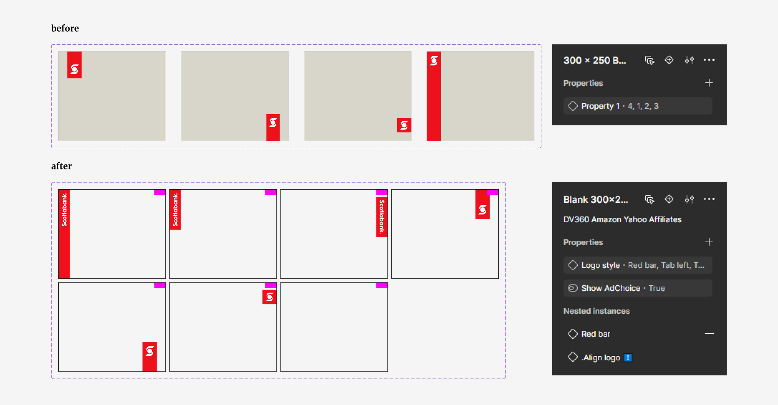
Next I learned the logo treatment was inconsistent between designs, designers, or even obscured by external elements (i.e. AdChoice banners). Despite the team’s best effort to leave notes next to components, not every designer followed the brand guidelines.
With these learnings, it helped us direct how we shaped the design system and required functions of the templates. We have campaigns with “evergreen” designs that do not change, and also have designers craft custom campaigns that need a “blank canvas” for creative freedom. This led to two tracks of templates: Prebuilt and Custom.
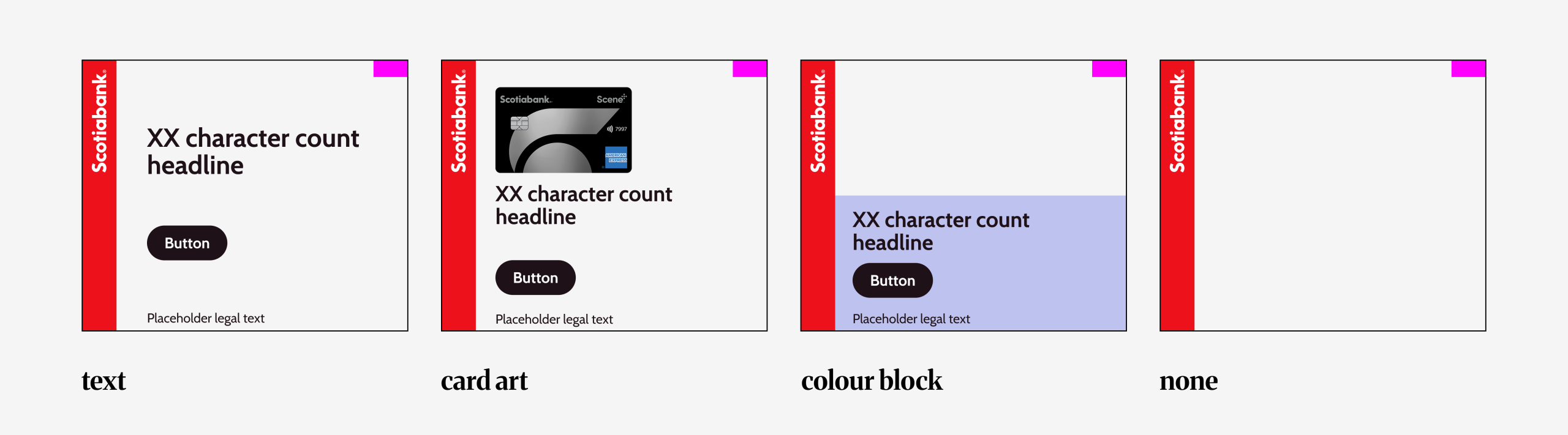
For prebuilt templates, it boiled down to the commonly used layouts: “Text”, “Card art”, “Colour block” and “None”. Even though the design is templated, it still allowed room for customization which is a very important requirement for the design team. For full customization, “none” which is essentially a blank canvas gave designers full freedom to design but still be on brand with fixed logo placements.
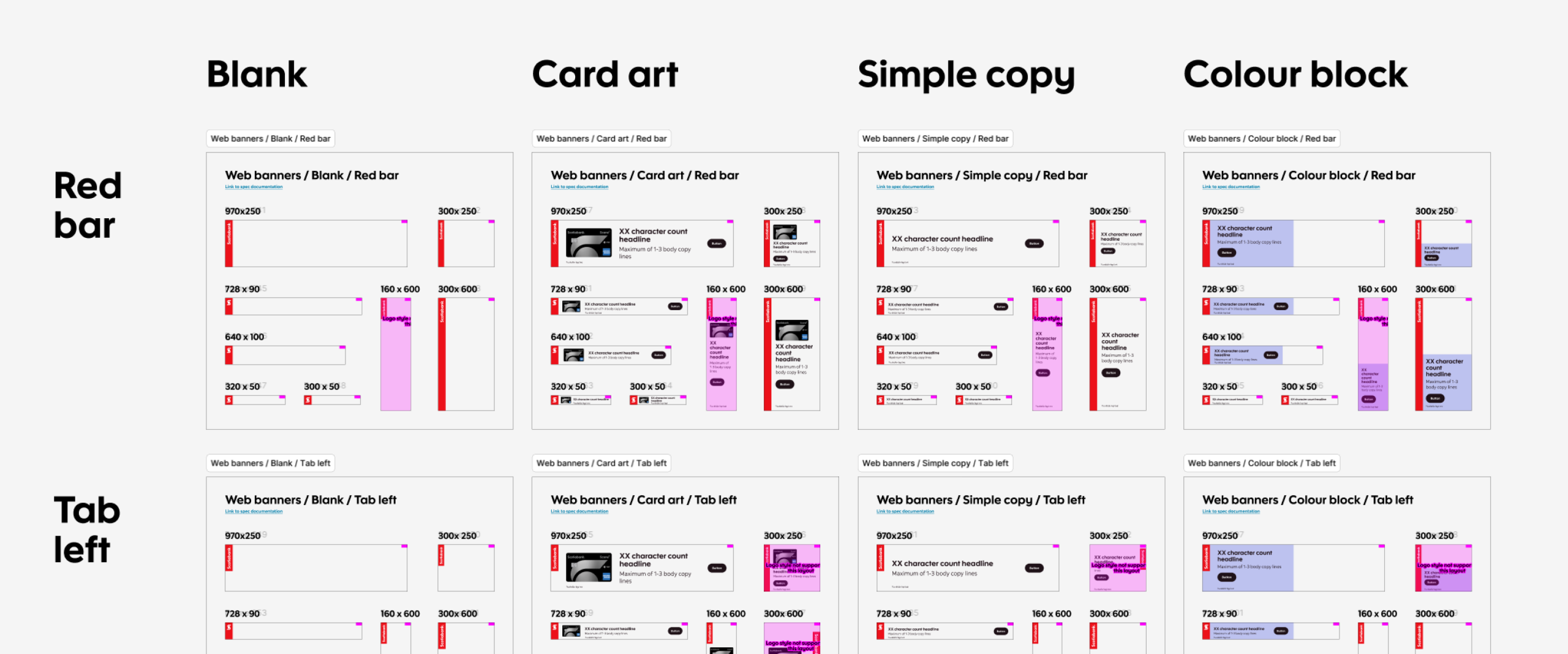
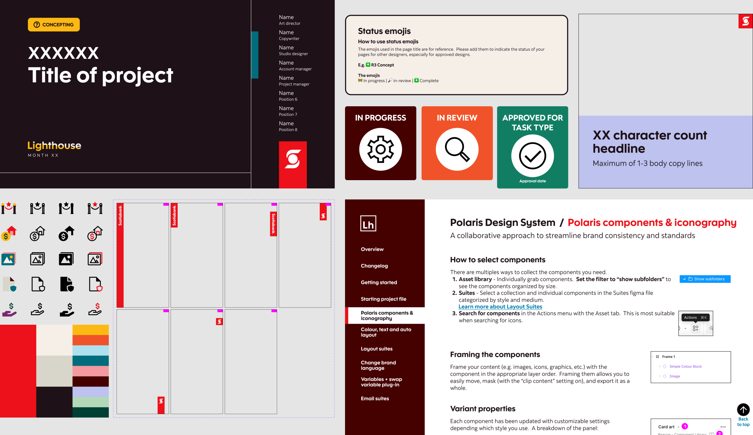
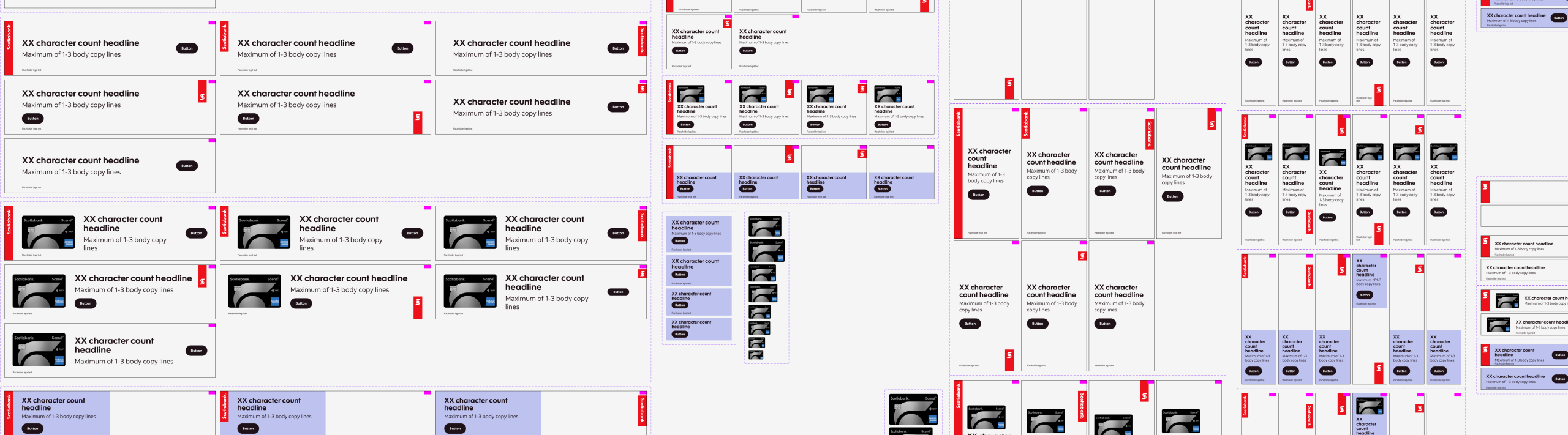
Next was solving the “browsing and choosing” behaviour. To ask our designers to go through the library panel was not an option nor was it optimal when it came to efficient workflow because of how tedious it would be for campaigns that required over numerous different components. This led to the opportunity of a collection of templates that I dubbed “suites”. Suites were sections of components layout in full view to streamline template selections, and were located in a separate Figma file that anyone can access. These sections of templates were grouped by media, logo styling and campaign types/sizes. This checked the box of allowing designers to browse what they needed in a more organized space and without the worry of components accidentally being changed (which user view access fixed), but also allowed them to be set up for workflow automation in our next epic.
epic 2: single source of truth for copy decks
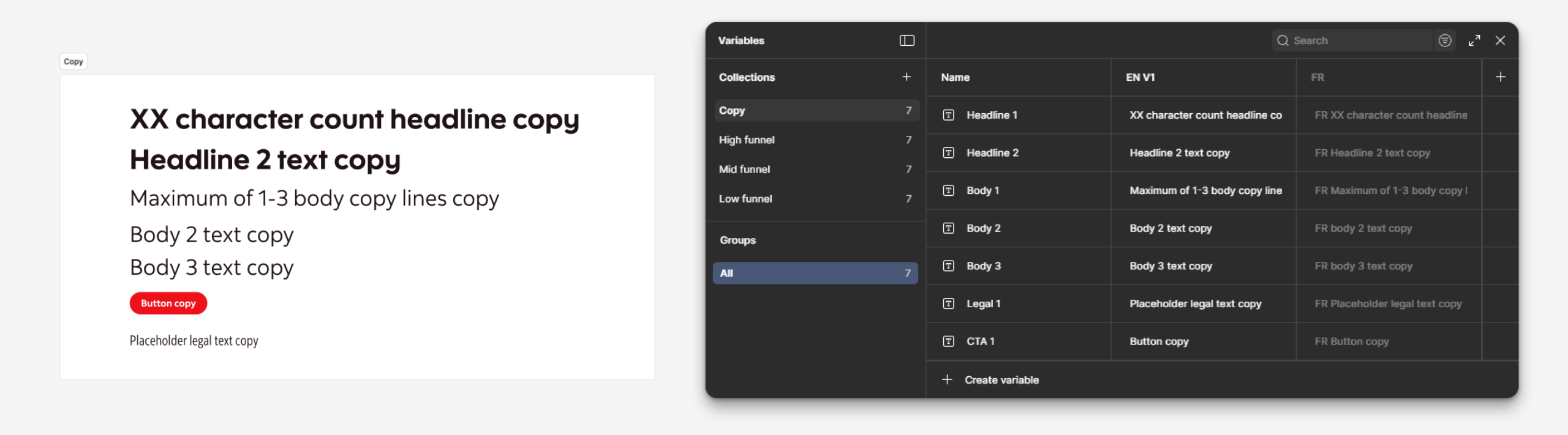
When working on a campaign from concept to production, the number of layouts needed could be in the hundreds, and entering and editing text was a major pain-point and largest time-sink for designers that we gathered from the interview. Pivots could happen without notice for a campaign, and that could involve changing images and copy. Images were already handled with components to allow for quick edits but text was treated individually, and for large projects with over a hundred assets to manage, human error could happen when copying and pasting text for an encumbered designer.
This was when the magic of variable text came in.
Variable text was not new, but applying it to the designer’s workflow immensely improved productivity and efficiency. For example, a campaign could also have different demographic targets which could involve a different image and/or message. The old method would have had the designer create one set of assets with Target 1 messaging, duplicate the set, and update all the required images and text (which would have been done individually) for Target 2. With text variables and a handy plug-in, time and effort was saved for the creation of other targets by initially linking the text to the variable table, duplicating the set and switching them between modes/collections at mass. And when there were changes to the text, that could be done through the variable table, effectively using it as a source of truth for text.
Within the pages, I added the most common template sizes for creative concepts readily available so the designer can spend less time setting up their file. And next to them are “stickers” that quickly indicate the status and location of wip or approved designs. This was very helpful for massive campaigns that are spread out on the canvas. As everyone would expect: every designer works and organizes differently with various levels of chaos. These stickers act as beacons when handing off projects to other designers. Other improvements that were added were a credit section so people knew who owned the project and page status with emojis, and many more small quality of life improvements.
Lastly, with the slimmed down page count, I included a page dedicated for education and resources. Which leads to our final epic.
epic 4: narrowing knowledge gaps
Like most agencies, the company hired many freelancers that come and go for a short time in a matter of months, so on-boarding them about the brand and processes should be important. Emphasis on should. Because of how fast-moving and tight timelines were for these projects, unfortunately new hires and even existing full-timers did not have the luxury to be fully on-boarded. The issue of department on-boarding was outside the team’s jurisdiction but within the working space of Figma, I had the power to make information more accessible.
As hinted in epic 3, all project files had a “Learning & Resource” page. This housed all essential information about the brand in quick digestible chunks and links for further reading. Those links led to documentation set up as a Figma prototype so it read like an interactive website. One for the brand; another for the Polaris design system. So now anyone who joined the team or needed a refresher could easily access it in any project file at their leisure. This also inadvertently solved “version-itis” of pdfs as well. No more outdated brand documents.
Lastly was educating everyone about the new processes, features, and workflows. Even with the availability of the Learning Resources page, we learned not everyone likes to read. So this led to creating workshops. At first they were lecture style slides which were, to simply put, boring and ineffective in retaining so much new information. Then I had the idea of a follow along. With a team of designers, a majority of them were visual learners so each workshop was crafted like a tutorial with everyone given the same resources and emulated simple scenarios which they could easily apply to their work. These one hour workshops were incredibly receptive and continued weekly to help designers retain the process. If anyone needed a little more assistance, we held 1:1’s.
The result
At the beginning, there was push back from some designers because we initially used the word “template” which components essentially were, but that term had and still has a negative connotation in the creative space. So we changed our language and how we presented the design system which smoothed out any anxiety or misunderstanding. The purpose of the design system that I built out was to reduce any unknowns and monotonous tasks so designers could focus on the creative process. Scaling out to different formats was now more efficient by capitalizing features Figma provided.
After one month with Polaris fully rolled out to the team, 70% of designers adopted the system but after introducing the workshops, it quickly grew to 90%. The designers recognized the benefits and flexibility it offered. It was noted that designers saved 60% of their time, meaning less was spent on revisions or repetitive tasks. This allowed designers to focus more on the creative aspect of a project than administrative. The design system continues to evolve and grow, expanding to other mediums such as emails, decks/slides and icons.